
Year 11 Art
One of the focuses in Year 11 Art this year was Fauvism. Fauvism was the first 20th century art movement and began in 1900 until 1910. The Fauves (also known as “Wild Beasts”) were a group of French painters which included Henri Matisse, Georges Braque, Maurice de Vlaminck and André Derain and is characterised by strong emotional colours and fierce brushwork.
Complementary colours are pairs of colours (Red & Green, Blue & Orange, Purple & Yellow). which appear opposite each other on the colour wheel, and when used side-by-side in a painting make each other look brighter. Additionally, the Fauves' use of simplified forms and saturated colours drew attention to the inherent flatness of the canvas or paper; within that pictorial space, each element played a specific role. The immediate visual impression of the work is to be strong and unified.
Above all, Fauvism valued individual expression. The artist's direct experience of his subjects, his emotional response to nature, and his intuition were all more important than academic theory or elevated subject matter
Akira Taylor


Akira's Artwork (left) has been influenced by the above Fauvism work- 'Woman at the window' (1915) by Rik Wouters (Oil on Canvas, 962x746mm)
Reflection
Akira Taylor
12th March 2021
Plasticine on wood
38cm x 30cm (oval)
This artwork was created to comfort the disturbed and disturb the comfortable. The oval shape of the wooden board was used to create the shape of a mirror, suggesting that it is a reflection. All the colours of the background reflect the people and the world around the person in the mirror, the body is a similar colour, showing that the reflection wants to fit in, to be “normal”. The colours around where the head would normally be shown the harsh reality of mental illness and how it actually effects people, not the way people in society portray it, or even romanticise it. The yellow, red and orange around the throat shows the feeling you get in your throat before you start to cry, there is also a green-blue colour near the stomach, showing the sinking feeling when your stomach “drops” and lastly there is a heart surrounded by colours, suggestion the heart is “guarded” or “closed off”.
A Loud Mind
Akira Taylor
12th May 2021
Acrylic paint, water colour, Perspex, wooden board, paper, spray adhesive
50cm x 24.5cm
This artwork was created and inspired by my statement of intention, that being based around mental health. In this piece I used a series of brushstrokes to display a multitude of different colours on the outskirts of the polaroid-looking border giving the artwork a feeling of being encapsulated or hidden. In the artwork there is a piece of Perspex glued upon a piece of paper, underneath there is an ‘explosion’ of water colour, symbolising the mind and how loud it can be, not matter how silent the outside world is, and painted on the Perspex there is a face, in black, giving the effect of a shadow. This face represents being alone, dealing with invisible issues, such as the ‘loud mind’ at hand. This artwork uses many soft-toned colours to show internal feelings and emotions, usually dealt with alone instead of speaking out loud.
Alara Toh

Untitled
Alara Toh
October 2021
Acrylic, on a can.
This abstract portrait depicts the woman’s need for social identity. The whole painting is on a can of a Redbull which was used to show the aspect of the need for energy in the ever-pressuring world of straining identity. The gold paint in the portrait highlights the mess of identity and covers the woman’s eyes preventing her to see her true self. The feel that was trying to portray, is the lost but also disported feelings as the painting wraps around the can’s side.


Alara's artwork (left) is an appropriation of Edvard Munch's 'The Scream' (1893)

Alara Toh
2021
Digital Photography


Briana Mitchell
This is your Project description. Provide a brief summary to help visitors understand the context and background of your work. Click on "Edit Text" or double click on the text box to start.


Briana's Artwork (left) has been influenced by the above Fauvism work- 'The pool of London' (1906) by Andre Derain (Oil on Canvas, 657x991mm)
Untitled
Briana Mitchell
12th March, 2021
Plasticine, acrylic paint, on wooden board
37cm x 30cm (oval)
The concept that inspired me to create and produce my final artwork was the idea of loneliness, self-growth and individuality. I chose to use the queen of the night flower and based my theme around this particular flower, which helped choose my colour scheme and created an in-depth storyline to my finished artwork.
I begun by sketching ideas and trial and errored contrasting ideas to determine the most appropriate fit that included my experiences, feelings, and my own life story. Once I chose a general idea that I felt was appropriate, I used acrylic paints to cover my board as a base for the plasticine that would be moulded over the top. I completed my artwork on an oval board, which to me represented a cycle and how my life was replaying itself over and over again, however I was beginning to grow and add my own personality and feelings to this cycle, as I became aware that I had a voice that mattered and that must be used. I then melted, blended and shaped my plasticine into the shape of the board, in a circular motion to create a flow of colours. I used yellows, reds, oranges, pinks, purples, and blues to create a sunrise effect for the background of my piece.
For the foreground, I used a rolling pin to flatten white plasticine and used numerous cutting tools and techniques to cut out and individually shape each petal for my flower. Initially, I had struggled with the concept of making the flower and I was unsure of how I could make it 3D. however, by layering each petal on top of anther, I was able to make the flower pop off the base which created dimension and depth.
The meaning of my overall artwork is to show my audience that you have a voice, and it only means something if you use it. I am growing within myself and am becoming more capable of using my gifts to support myself and others around me. The queen of the night flower only blossoms at night, and is not seen to the naked eye fully blossomed during the day. The concept of placing the flower fully blossomed at sunrise and not hiding reflects myself and my power and strength to have faith and pride in what I do.
The artwork that I have created makes me feel calm yet ecstatic, sad yet powerful. I am completely proud of myself for accomplishing what I have and how I have done it. I have persisted through struggles and come out the other side stronger. The opportunity to create something that reflects me and my journey has paid off and I would not change a thing about my artwork because it is me.


Epiphyllum Oxypetalum Draco Vulgaris
Briana Mitchell
21st May, 2021
Acrylic paint with medium thickener, white charcoal pencil, gold ink pen on black card paper
594mm x 841mm
The concept that inspired my second direction artwork was the growth from my initial artwork, including the strength I have acquired and the power I am constantly gaining through finding and loving myself. I chose to expand on ‘the queen of the night’ flower and add my own power and pride in the form of a dragon tattoo, that represents the strength of myself growing on my own skin for the world to see. I decided to use a subtle yet bold and powerful colour scheme to match my feelings, which included a solid black background, a person in white, and the dragon and flower in gold tones, which adds dimension throughout my piece. I also chose to add my own personality through the gold earrings, as they are my own piercings.
I chose to use a white colour scheme for the person in the piece as it is abnormal, as usually shadows in an artwork are darker than the light areas, however I contrasted this by taking a different approach to the ‘monochrome’ tones and the lightest/whitest parts of my work are the shadows, and the darker areas are the highlights. This concept also relates to the flower I have used in my piece, as it is a mixture of white and gold, showing that the darkest and strongest parts of me are those that I am most proud of as it shows discipline, determination, and self-understanding. By mixing the white paint mixture with gold paint, I am able to carry the flow throughout the entire piece and am able to link the strength inside me to the powerful dragon tattooed on the skin of the person in the artwork. I chose to use a dominant gold dragon tattoo intertwining from the woman’s collarbone, to behind and around her neck, finishing up at the top of the head, to show the love, determination, and intensity coursing through me, that is changing me into a person I believe is worthy of life. I chose to use the same flower as my initial idea, the ‘epiphyllum oxypetalum’ (or ‘the queen of the night’), however in a different style, to show the ultimate growth and magnification of my own personality.
This artwork ultimately makes me feel proud of myself as I am showing my own broadening and self-love and worth by opening up to the world and exposing myself. This was not difficult for me to decide as I am becoming more confident in my own work and my own decisions.


Unit 2 Appropriation Artwork
Unit 2 Cultural Artwork
Unit 2 Photoshop Artwork


Brooke Halbish


Brooke's Artwork (left) has been influenced by the above Fauvism work- 'The Open Window' (1905) by Henri Matisse (Oil on Canvas, 553x460mm)


Aurora Borealis
Brooke Halbish
30.03.2021
Plasticine on wood board
43 cm x 30 cm
My final artwork inspired by the northern lights which I named aurora borealis because it’s the scientific name for the northern lights. My artwork shows various colours which include deep black across the top and bottom, deep blue blended with the black, purple blended with the blue, pink blended with the purple and the bottom. The swirls of colours in the sky green and light pink, I have also included trees. I created my artwork by smearing plasticine onto a wood board. The message and meaning behind my final artwork are that I have always had a fascination about the northern lights which thought how cool and magical it looks hopefully one day can see the northern lights in real life. My overall thoughts on my artwork are that I am overall happy how my design turned out, something I could improve on with my design would be that I would have liked the trees to be much neater. I learnt and experimented with plasticine in this SAT which was a bit of trial and error and which quite fun to use.
Paradise
Brooke Halbish
21st May 2021
Water colour on watercolour paper
43 cm x 30 cm
The artwork called paradise I created which is a water colour painting using the black water colour disks. My artwork is a palm tree set on a tropical island with a blue-sky background. The sky background goes from a dark blue to a very light shade of blue, with the colours blended together. The palm tree with many different shades of green, a few of the palms have a dark outline of blue which works very well and makes it standout. The bottom of the page has sand which is a light yellow and light brown colour. I created my artwork using water colour to create the palm tree I first did the trunk and then I started with a blue colour then over the top I used a yellow shade which depending on what shade of green I wanted would be how much water I would use, only using those two colours I created various shades of green. The theme of my artwork is nature. The meaning behind my artwork a palm tree on a tropical island is that it symbolises calmness, peace and the beauty of nature. The personal meaning behind my artwork is that I find palm trees that look so calm and the beauty of nature is amazing. Overall, my artwork I created I think some components of my artwork I feel I did very well and other parts I feel I could have done better. For example, the colours in the palm tree worked well, and the blended sky. But I think I could have put more work and effort into the sand, which I think I could have added clouds to the sky.

Journey
Brooke Halbish
23.10.2021
Circle Paper on Matt board, A4
background mixed collage
using different papers.
29.7 cm x 42 cm
My final artwork titled ‘journey’ inspired by my Nana’s journey coming to Australia. The artwork which has a very meaningful message behind it because the whole artwork is about my Nana’s journey from Croatia when she migrated to Australia. The medium I have used to create this artwork is a circle painted paper on Matt board, stuck on A4 paper which I have created a collage using different papers, textures and patterns. In the circle which symbolises a map and the path she took to get here to Australia, which is why I did the road like curved line, the background behind that is her story about coming to Australia. Overall, my final artwork has some really good features and elements such as background collage is a really great background.


Cadence Vakacavu


Cadence's Artwork (left) has been influenced by the above Fauvism work- 'Big Ben London' (1906) by Andre Derain (Oil on Canvas, 660x991mm)

Inside Out
Cadence Vakacavu
30th March 2021
Acrylic paint, Plasticine on wood
30 cm x 43 cm
My artwork is a visual representation of how I view social anxiety. I chose this theme because I have been through it and am currently growing and working out of it.
The artwork is of a lone figure in the centre surrounded by a group of dark, eery figures. The red setting is to give off an eery off feeling. The artwork if full of symbolism such as the eye rolling back representing a dying or dead feeling. This is my way of playing into and showing the depression that social anxiety can cause.
Another example are the bars in front of the of the eye representing the trapped feeling of going no where that social anxiety can cause.

Inside Out
Cadi Vakacavu
Watercolour, Fabriano paper, charcoal
May 2021
29.7 x 42 cm
My artwork “Inside Out” follows the theme of anxiety. The artwork is of a young male named Hwang Hyunjun, who has faced issues with anxiety. The artwork created indifferent media provides the view of how an outsider may view one with anxiety and how one with anxiety views themselves. The charcoal side of the artwork represents an outsider’s view of someone with anxiety as dark and gloomy. Using charcoal also helps me capture tone, making one of the half of the portrait look more realistic, the harsh reality side. Whereas the watercolour provides a messy view and non-realistic feel, representing the way a suffer of anxiety views themselves. The red tones of the watercolour creates an eery feel, providing the scared, fearful feeling most with anxiety feel.


Caitlyn Kelly


Caitlyn's Artwork (left) has been influenced by the above Fauvism work- 'The Desert: Harmony in Red (the Red Room)' (1908) by Henri Matisse (Oil on Canvas, 180x220mm)
Beauty Before Darkness
Caitlyn Kelly
18th of March 2021
Plasticine
29cm x 25cm
I created a sunset look with blended and smeared plasticine onto a cut piece of plie wood. This work was created to represent the sense of beauty before darkness, the beauty of the sky and all the colours across the sky before night falls. The mood created was a calm light breath feel, relaxation and enjoyment of what is in front of you.
To represent the sunset, I used a range of different shades of blue, yellow and orange. Blending the colours together and using tools to cut and create a sun.

Beauty before Darkness
Caitlyn Kelly
26th May 2021
Acrylic paint on card
53cm x 76cm
Beauty before darkness was a theme, I had chosen for this second direction artwork it. My whole theme coming under breast cancer awareness that was inspired by my mother struggle after being diagnosed.
the meaning behind my artwork is that there are always beautiful things shining through before the darkness overtakes and that’s all you see. There are beautiful things hidden amongst our struggles and that was what I wanted to represent. I contrasted her use of her head angle to allow you to see the emotions without seeing a face. On one side we see her facing up towards butterflies which I used as a symbol of life and living to our full protentional but on the other side we see her facing down darkness has taken over and the only thing we see is a handprint covering her scars of her battle. This artwork is supposed to make a person feel and understand that anyone can be struggling behind closed doors.
Pink being the colour for breast cancer I used that in small details to allow and understanding. I used thin brushes and light brush strokes to get the details of the hair, using a bright skin tone colour on one side to allow light to come through but on the other used monochromatic colour scheme to symbolise the darkness of one’s struggle.


Eliza-Cathryn Emmet


I to I
Eliza-Cathryn Emmett
22.09.21
Derwent pencils, Eraldo di Paolo cartridge paper
297 x 420 mm
This piece reflects the sympathy and distance between males and females. Today there is a lot of strife, miscommunication and misunderstanding when it comes to the power struggle of genders within our society. With men and women both facing their own issues it seems to be commonly spoken about who has it worse. I perceive that when it comes to gender that no one has it worse than the other, and I hope my work reflects that. Having both flowers a pink tone shows how delicate people can be with their emotions, whilst the grey lead sketch lines around them remain, as gender conformities are developing. The journey to understanding will entail great challenges as represented by the water and can appear to be a distant and unreachable goal. Where the preconceptions of gender roles among society can cloud the path to unity. Although men and women are very different and their own people, we are still all connected through the earth.


Haylee French


Jaxon Marthinussen


Jaxon's Artwork (left) has been influenced by the above Fauvism work- 'The River Scene at Chatou' (1906) by Maurice DeVlaminck (Oil on Canvas, 826x1109mm)

Sunset Beach
Jaxon Marthinussen
18th March 2021
Paint, plasticine on wooden board
37.8 cm x 30 cm (Oval)
Sunset Beach reflects resurrection, victory, peace and calmness. I believe palm trees represent love and relationships such as my special relationship with my twin sister. The background behind the palm trees includes a beautiful sunset with birds in the sky flying free and clean blue water lapping the sand where I would love to sit and watch the sky change colours. Watching the sun set is relaxing for the soul and body.
.jpg)
Soldier Number 473
Jaxon Marthinussen
21/05/2021
Metal wire, calcio, buttons
20cm X 12cm
A physical artwork of my great grandpa who served in ww2 I made his faceless to symbolise his aching heart that is now forever emotionless after the horrific scenes he has witnessed. A lost arm to represent the bravery. And the soldier is leaning down in honour of his fallen friends.
.jpg)

Split Reality
Jaxon Marthinussen
7th October 2021
Pencils on A4 paper
42.5 cm x 28.5 cm (rectangle)
My inspiration behind this artwork was heavily based on the concept of acknowledging my past, the sacrifices, journey, and comparison of my ancestors back in the day compared to present day and basically how time has a heavy effect on one’s life. I decided to describe this best by splitting my artwork in half (same people different period); one side of the artwork is an insight to what life was like in 1865 for my ancestors and the opposite side is an insight to what it’s like living in present day, ultimately comparing the differences in a unique way. I decided to make it the same person as I would have relatively similar features from my ancestors considering they are my bloodline. This artwork gives me a sense of amazement recognising how majorly living in a certain period can affect the same person, but overall makes me happy knowing that I was creative enough to put this into a perspective for everyone to see. The colours I have incorporated consist of one side of the artwork in colour and the other not in colour to represent the present and the past and ultimately to show a time gone and how much more the world has improved since those times. I also decided to make the comparison time 1865 which is the day that Tennessee adopted its new constitution that abolishes slavery.


Jayden Moore


Jayden's Artwork (left) has been influenced by the above Fauvism work- 'Maria' (1910) by Keyes Van Dongen (Oil on Canvas, 648x543mm)

Untitled
Jayden Moore
18th March 2021
Plasticine on wood board
38cm x 30cm (Oval)
Elisabeth Murdoch College
What inspired the theme of this artwork was my own social struggle throughout my time in school. My main issue is the fact that I have grown apart from my friends, sharing less and less. I see other people like this around me, and feel for them. But I don’t say anything. There is an arm wrapped around my throat, preventing me from saying anything. And that arm belongs to the version of me people see every day.
We can see another one of those arms in my artwork. Doing the exact same thing to another person. She can’t talk either. All we hear are the words coming from the mask she wears every day.
This artwork isn’t about anyone in particular. It applies to a large category of people who feel like they are alone. This artwork is a demonstration of my empathy for them, because I have felt the same way before.
The silver background and depressing expression of the mask create a sense of emptiness, a mood that was intended.
The girl herself is rather pale (I used almost purely white plasticine), but has colourful hair. The colours in her hair symbolize that the girl underneath the mask is far more colourful than the mask. It also shows that there is no colour in her surroundings, and that she is alone. This gives the background a somber/eerie tone.

Open Eyes
Jayden Moore
2021
Clay sculpture
Undetermined size
In this artwork, I was inspired by the unfairness of being forced to hide who you are by society, so I made it my theme. Experimenting with different media/mediums, I decided a clay sculpture would solidify the girl’s status as a human, giving her form to show that you could theoretically reach out and touch her, just like any other human being. What I wanted to depict in this artwork was someone who had just broken free from society’s expectations, and was about to be reborn as themselves. Using symbols such as the butterfly, representing rebirth, but disguised as wings, which represent freedom, and a naked body, which also represents freedom, I was able to show how happy one could be if society didn’t suppress their values and personality by passing judgement. I, myself, know people who seem to be holding themselves back, which creates a sort of barrier between us, preventing us from being closer. They do this because they have adjusted to society’s norms, which teach people to adapt your personality in order to please everyone, which isn’t possible. I believe it is better to be yourself, even if people will judge you for it. The artwork possesses an eerie, but exciting mood. Like the bad stuff is about to be over, and the good stuff is about to begin. The colours of the artwork are rather bland, excluding the wings, which show colour in suit of the girl’s true personality. Blue is a common symbol of loyalty, and I used that here to show that she has had to rely on herself, due to her being unable to trust.

Two Lives
Jayden Moore.
2021.
Ink on paper.
Inspired by the bright lights and colourful posts of Social Media, I wanted to create a scene that showed the balance between real life and the camera. Too many people chase fame in sacrifice of their own health. I believe that there can be a good balance, but Social Media should take up way less than half of your life. Remember to keep time for yourself, and your family. This artwork is a friendly message and reminder that you can’t do it all at the same time, so you have to make time.


Jessica Sallemi


Jessica's Artwork (left) has been influenced by the above Fauvism work- 'The Open Window' (1905) by Henri Matisse (Oil on Canvas, 553x460mm)

Reflection
Jessica Sallemi
16/03/2021
Plasticine on wooden canvas
38cm-30cm
I was inspired by the ocean for this artwork, to me the ocean and beach represents a calming atmosphere to let your thoughts free and just reflect and so I added this to my piece. To create the sunset, sky and ocean I rolled small pieces of plasticine and spread them on the wooden board to create a base, I also slightly blended them with my fingers to soften the definition, to create the light house and cliff I cut out shapes and then stuck them onto the artwork, in order to make it look like the light house was shining I added yellow and white around the light pole to give off a bright shine affect. I, like many people suffer from anxiety, so I wanted to create a piece of artwork that people could look at and just relax. This artwork definitely makes me feel calm and relaxed, the use of light blues, pinks and oranges contribute to this since they are light happy colours.

Imperfect, Perfection
Jessica Sallemi
20/05/21
Watercolour on paper
297 x 420 mm
I brought in my previous artwork “Reflection” to loosely influence this artwork, I was inspired by the peaceful and free atmosphere and decided to dive deeper for “Imperfect, Perfection”. The ocean has forever and will always bring me to the calmest and free that I can be, so I decided to bring it back for this artwork. The new aspect I have added into this portrait is a woman, the woman is naked in the middle of the ocean which represents being careless and free. The technique I used in this artwork was watercolour. Water colour was used to blend and bleed the colours into each other leaving an imperfect look in which I felt was best for my carefree theme. My artwork displays being able to feel your most vulnerable in the natural element. Anxiety is a major part of many people’s lives, and my portrait represents letting all the stress and worries go. The use of soft blending has created a softer more subtle atmosphere in which has helped create a peaceful mood. The portrait displays a night-time setting which involves darker colours such as blacks, greys, and blues. The colour blue can create a sleepy and calming mood which contributes to the representation of peace.

Perfectly imperfect
Jessica Sallemi
17.10.21
Acrylic on canvas
27 x 25cm
Growing up I have always looked up to powerful women, it was always the ones that were confident and knew their worth. But nowadays, for many young women, such as myself, body image is a tough subject. We often scroll through social media which is full of “perfect” women, which leaves us feeling unworthy. We tend to judge every miniscule imperfection about ourselves thinking our bodies aren’t beautiful. My artwork represents the beauty in all our insecurities. From the hip dips to the stretch marks, we are all beautiful.


Kaylee Rimmer


Kaylee's Artwork (left) has been influenced by the above Fauvism work- 'The pool of London' (1906) by Andre Derain (Oil on Canvas, 657x991mm)

Her Higher Self
Kayley Rimmer
2021
Plasticine on wood board
38cm x 30cm (Oval)
Elisabeth Murdoch College
‘Her Higher Self’ represents femininity and spirituality. This artwork is to show the women body and how powerful it is. The use of bright colours is to give a sense of happiness and hope. This artwork is to inspire and empower women to embrace their flaws and fall in love with themselves again. In this day and age people are pressured to fit into the beauty standard. Her higher self is to show that none of that matters. You shouldn’t have to feel pressured into looking a certain way. Women are powerful and you do not need validation from anyone to feel that power. All women are beautiful, all bodies are beautiful.


Mollie Conlin


Mollie's Artwork (left) has been influenced by the above Fauvism work- 'Seascape L’Estaque' (1906) by Georges Braque (Oil on Canvas, 590x724mm)


Ollie Mether

Ollie's Artwork (left) has been influenced by the above Fauvism work- 'Luxe, Calme et Volupte (Luxury, Calm and Pleasure)' (1904) by Henri Matisse (Oil on Canvas, 985x1185mm)

Sunrise in the trees
Olivia Mether
01-04-2021
Paint, plasticine on wooden board
37.8 cm x 30 cm (oval)
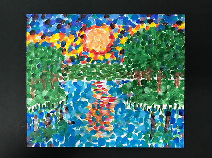
What inspired me to create “The Sunrise in the Trees,” is from a sunrise as well as the theme of depression. I wanted to create this piece as such for it to remind people all that the light can always return to sight as a lot of people who suffer from depression can think that the light won’t return, and the darkness will take over. The message I’ve conveyed in this piece is “The light will always return, even in the darkest of times,” because I know out there in the world, there are people who suffer from depression and they think their cheerfulness won’t return. Which is something I went through for a while, so, basically the reason why I chose this piece is to remind people the light or happiness with return. Personally, I’ve never had experience with plasticine, but it seemed fun to do, which it was. But before this unit, when I saw the way it was placed and techniques that can be used which looked enjoyable and fascinating. It was time consuming, but that is something I’ve had experience with as I do a lot of pixel art in my free time. Techniques I used within this piece are the arts elements and principles such as colour, texture, line and shape as well as contrast within the piece. When I look at this artwork, I feel calm and relaxed like I have free well over my actions when depression takes control. The different colours of purple to me have a calm like meaning and I’m happy I chose it as I can possibly make others calm when they look at this piece too. Though purple has the meaning of fear, when interpretated in ways, it can become another meaning, like as I already stated, I used the colour to create a calm space.
.jpg)
.jpg)
.jpg)
Hidden
Ollie Mether
13-05-2021
Photography on digital art
4960 x 3508 mm (A3 Landscape page)
Inspiration I had gathered for this photograph ‘Hidden’, is from the sexuality I recently introduced myself to and it made me realize how many people are insecure about coming out to the world. I wanted to show people in this artwork to represent the message of “don’t be afraid to show who you are” to let people know that they should try find confidence and show people who you truly are. When I first came out as Non-Binary Lesbian, I was insecure about it, which made me depressed. I wanted to create the theme of hidden identity into my artwork for this unit, which helped me come out and tell people about my sexuality. Personally, I’ve had experience with digital art and photography and have been playing around with each media which is something I really enjoy. It took some thought to find the right angles for the photography and find the right brushes and tools for the digital art and was fun to utilize the skills of photography and digital artwork to create this series of photographs. When I look at this artwork, I see a hidden identity and insecurity evident in the mask covering the eyes, the flag in the background representing sexuality of the figure and the dark filter added to represent depression which is what I felt and trying to bring forward the emotions within the photographs


The Girl and Her Pride
Ollie Mether
420 x 297 mm
digital art
23/08/2021
I had created the digital artwork ‘the girl and the pride’ from the inspiration of the LGBTQ and the sexuality I identify. I chose to interpret the pride flag to show that you should ‘Be who you are’ and not let anyone tell you otherwise. To me, it means to be happy no matter what your sexuality or gender is, what your hobbies are, but be happy for who you are and don’t let anyone stop you from being you. The techniques I had used in this drawing are line, colour, blending and light. The colours I have used are skin tones, shades such as black, white, greys, browns along with red, orange, yellow, green, blue and purple. The rainbow colours are to make up the pride flag whereas the other colours are to make up the girl. I feel happy when I look as this piece because it’s like someone is proud as they should be when coming out about their sexuality. I know a lot of people can be worried about coming out and being apart of the LGBTQ+ community, and it’s a big thing. It’s an exciting thing.


Ruby Thornburn


Sarah Lazarus


Sarah's Artwork (left) has been influenced by the above Fauvism work- 'Woman with Black Hat' (1908) by Kees Van Dongen (Oil on Canvas, 1000x815mm)

Isolation Kills
Sarah Lazarus
23rd of March 2021
Plasticine on Wooden Board
H35 cm x W30 cm
This artwork ‘Isolation Kills’, was an artwork based of the theme Isolation, inspired by my time alone at home during most of 2020.
For this artwork I was applying plasticine to the wooden board, smudging on to the board, but also adding form and shape to the artwork by bringing the plasticine out and making it three-dimensional.
The meanings behind my artwork are isolation can affect people differently, this person in the artwork feels distressed and lonely due to this loneliness, similar to how I feel.
This artwork I have made, creates a feeling of sadness and despair, making people feel upset and unhappy.
Dark colours were used as a symbol for the darkness you feel when you’re so alone, bright colours to show what little life and hope is left, like the orange of the butterfly and the red of the heart, the small amounts of hope that is left.

Beneath the Water
Sarah Lazarus
21 May 2021
Water colour, Water colour Paper
A3
My artwork had much symbolism, representing my feeling during quarantine when I felt Isolated, the theme for my artworks.
The locked cage the person is in is representing that the person feels trapped, the water drowning them and the cage not allowing them to escape and breath. The water being there because they feel like they are drowning in emotions and feelings like they can’t escape or stop to take a breath. The person is a shadowy figure because they feel hollow and empty, like they aren’t really important or like they are worth anything, they are crying silver tears, silver representing strength, the strength leaving their body. They are reaching out the cage for help from the other people on the cloud, they them having the key to let them out, but being out of reach and too far away, representing how the people how could help me were too far away and too far out of reach.

Sakura
Sarah LAZARUS
Acrylic Painting on Paper and Canvas
29.5 x 40 cm
I choose music as my theme, because music makes me who I am now, it influenced me into the things that a like and enjoy now, it made up my personality. In my artwork, I tried to resemble how music influences different people’s perspectives and personalities.
The headphones represent a modern form of music, something that is relatively new. Whereas the music sheets are something that has been around much longer than the headphones, when instruments were invented. My artwork expresses the theme of music, as shown with the headphones and the music sheets, showing a more obvious form of music shown. The music sheets dyed with tea to solidify the less modern form of music, making them look older. The landscape was to represent the calmness and relaxation I feel when I listen to music, as if it takes me to a different place, the Sakura (Cherry tree) symbolising a time of renewal and optimism, the bridge going over the water, symbolising communication and union, moon and star symbolises the rhythm of time.
This artwork creates a mood of relation and tranquillity.
The colours also representing, the black representing the emptiness and darkness, the colours representing the happiness and brightness. The person on the left being the colourful one and the right one not, representing that the left side of the brain is considered the creative side, the right side of the brain is the logical side. I used green and blue (analogous colours) and red and green (complementary colours) to draw viewers’ attention to the artwork more.


Shar Bishop

Brittle Mind
Shar Bishop
May 2021
Watercolour, and watercolour paper
30cm x 42cm
Brittle Mind, 2021, represents the fragile mind of humans, how we feel our minds cannot be broken. The anxiety, anger, sadness, and emotions our fragile minds feel contributes to our self-destruction and the breaking of our mind itself.
The use of the deep colours of purple, pink and blue represent the mind feeling all over the place and disoriented. The colours bursting out express that she is feeling frail mentally and lost.
The chains that are wrapping around the girl’s body represent not being able to escape the reality of feeling like she is falling apart and trapped. The butterfly on her shoulder represents her innocence, being peacefully vulnerable. The girl is wearing no clothes, symbolising how vulnerable she is feeling mentally. Although she may feel strong physically, sometimes your mental state can make you feel physically weak.

Reject
Shar Bishop
October 2021
Gouache, and mixed media paper
14cm x 21.3cm
Reject, 2021, represents the abandonment of animals and pets, whether by surrendering, or leaving the animal to die. The fear we place upon our pets when neglecting them, affects them forever, anxiety and distress caving in on them, wondering what they did wrong, to the person they love most.
The contrasting tones of black and white, convey feeling embodied in darkness, light is still visible, but not reachable. Sparkling eyes covered in the darkness, showing the vulnerability and innocence of the dog’s intentions being misunderstood.
The dog is drinking from his bowl, the word reject written in a bold bright red, placing a huge focal point on the feelings of rejection, as if the dog is drinking his rejection, accepting his fate.


Tegan Burnell

Tegan's Artwork (left) has been influenced by the above Fauvism work- 'Landscape at L’Estaque' (1906) by Georges Braque (Oil on Canvas, 727mm)


Forever Satyr
Tegan Burnell
2021
Watercolour, metallic permanent marker, fine liner
26.5cm x 22cm
The meaning of my artwork is the forgotten by most, creatures from Greek mythology will remain in some form or another, remembered by those who follow tradition and those who are curious about the Greek culture. The bold colours are meant to be distracting to symbolise the modern world and how mythology isn’t valued as much by many as traditional values that made up the past. The creature itself is supposed to reference a satyr (a creature from Greek mythology). The god of fertility was satyr called Pan valued in Greek culture as most families wanted an abondance of children. The spiral horns coming out of the head of the creature are meant represent great creativity, which is a reference to myself. The reason the creature is a statue is to symbolise its long life through sculptures, painting, tapestries, and storytelling, because even if something is dead it can be kept alive through these things. Statues were also a valued part of Greek culture. The gold leaves are meant to be a reference to a Greek leaf crown.


